Clickable Prototype Creation
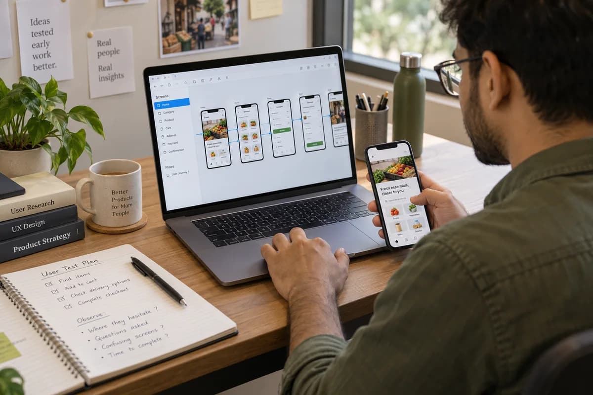
Clickable prototype creation links screens together so a person can tap through a whole journey on a phone. Nothing is saved behind them, and no database is involved.
Where a prototype is used
- Watching a shopkeeper or patient attempt the journey without coaching
- Showing a partner, a bank or a board the idea instead of describing it
- Settling an internal disagreement about how a step should work
- Finding a confusing step while moving it still costs nothing
What a prototype is not
The limits are stated before work starts.
Choosing what to link
Not every screen needs a working path. Link only the journey you want to test, such as placing an order, and leave settings, profile pages and rarely used menus as plain pictures or leave them out. A narrow prototype gives cleaner findings because testers cannot wander into corners nobody designed. It is also quicker to change between rounds.
Running a test session
Hand the tester the phone, name the task and leave the screens unexplained, because an explanation removes the finding that the session exists to produce. Watch where the thumb hesitates. Note any question asked aloud. A handful of sessions run this way show more than a meeting where everyone agrees politely.
Setting up a fair test
Small choices in the setup change what you learn.
What a prototype engagement hands over
- A link that opens on any phone, with nothing to install
- The screens in the order a real user meets them
- Notes from each session, against the screen where it happened
- A short record of what changed between rounds
A prototype session from setup to feedback
A prototype is judged in a room with a real person holding a phone. The day follows a simple order of preparing the link, watching the tap-through and writing up what was seen. Each step has its own owner. Roles are clear.
Decisions before the first screens are linked
Linking screens forces choices that stay hidden in a slide deck. A founder settles a few of them now so that testers meet a believable journey. Each choice is cheap to make on paper and costly to reverse later. Pencil is enough.
Questions to settle before rollout.
Use a representative scenario to decide what this part of the system must show and where review is still needed.
Clickable Prototype Creation
Can someone correct a mistake without losing their earlier work?
Use “Clickable Prototype Creation” to test an incomplete submission with keyboard-only input. Check the error wording and retained values before signing off the screen.
Background reading: W3C: usable form validation
Frequently asked questions
How does clickable prototype creation differ from wireframing?
Wireframes are drawings that show structure. The prototype links those screens so a person can move through them on a phone. Projects can use both, and the prototype is the version shown to users.
Can the prototype become the real application?
No. Prototyping tools produce the appearance of an application and not working software, so the build starts separately. Screen structure, wording and testing decisions carry across. Nothing else does.
Will testers think it is real?
They may. Testers are told that nothing is saved, so they do not enter real details or expect a reply. Anyone shown it outside your company gets the same note in writing.
How many people should try the prototype?
Nielsen Norman Group suggests no more than five users per study, and a small round like that surfaces the main stumbling blocks. If you serve very different groups, such as shop owners and their customers, test each group separately.
Do we need a polished look for the prototype?
Not at first. Plain screens are enough when the question is whether people understand the steps. Visual polish matters later, when the question becomes whether the product feels trustworthy.
Which tool is used to build the prototype?
A design tool such as Figma is the common choice, and it produces a link that opens on a phone. The tool matters less than the task you give testers and the notes you take.
Tell us what you need.
Tell us what your team does today, where work gets stuck and what you want to change.
What happens after you share your requirements
- We review your brief and the systems you already use.
- We clarify the workflow, missing information and the work to consider first.
- The proposed scope sets out the deliverables, responsibilities and dependencies.
- Review the scope and commercial terms before deciding whether to proceed.
Start with your requirements
Describe your current process, the people involved and the change you need. Start with the details you know; we can clarify the rest together.
Share your requirements