In this guide 6 sections
A good dashboard is built around the decision one user must make, not around every reading a sensor produces, so state, trend and alarms show at a glance. It must also separate disconnected from normal. A person can acknowledge each alert and record who did what about it, which turns a passive display into a proper working record for audits.
Who is looking and what they need to decide
An operator on the floor, a maintenance technician and an owner reviewing performance each need a different view of the same underlying data. The operator needs status and an obvious alarm, the technician needs trend history to diagnose a fault, and the owner needs a summary, not a live feed.
One screen for all three satisfies none. Define each audience and the specific decision it makes before laying out a single chart, and treat each view as its own deliverable rather than one undifferentiated “dashboard.”
Readings, trends and thresholds together
A current number rarely tells a viewer whether something is fine or drifting toward trouble, so show a short trend line beside it with the threshold marked. The trend answers that instantly.
Freshness deserves equal prominence. A last-updated timestamp should sit beside every value, so a viewer can tell “current and normal” from “silent for an hour and possibly not normal.”
Normal, alarm, disconnected and maintenance states
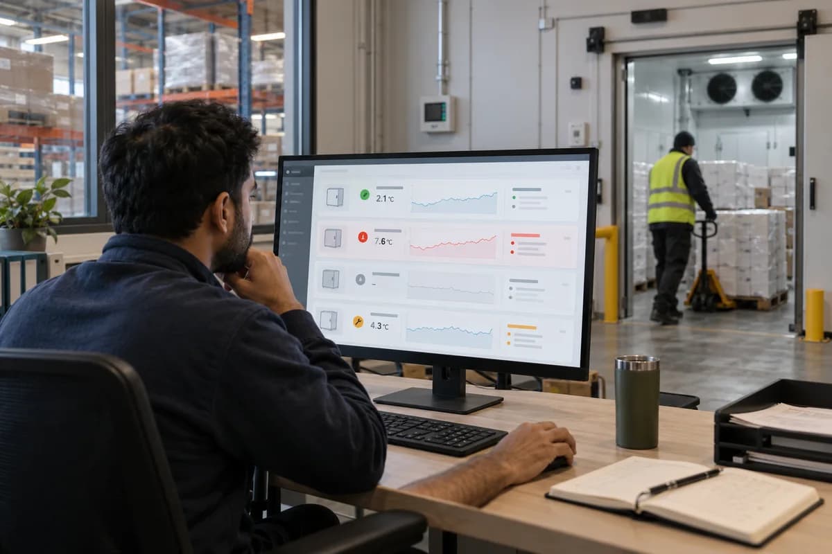
A common design failure shows a disconnected sensor like a normal one, with an old value frozen on screen. Then “we don’t know” reads as “everything is fine.” Make the states look different. Differences that only appear in a tooltip do not count, because nobody hovers over a tile that looks healthy, so use colour, icon and label together.
A device taken offline for servicing is a fourth state, separate from an unplanned disconnection, or routine work looks like a fault and people learn to dismiss it. Alarm fatigue then spreads to genuine problems.
Acknowledgement, history and role-specific views
Take a 3PL company monitoring cold-chain temperature across six warehouses, where nothing records who saw an alert, when, and what was done. When a client later asks how a temperature excursion was handled, there is no answer, and the dashboard proves to be a screen rather than a record.
Role-based access matters too. A client checking on their own stored goods should not see another client’s data, and a technician answering an alert does not need unrelated business reporting. Building this in from the start avoids retrofitting access controls later, once more people already hold broader access than they should, and resist losing it.
Testing whether operators can spot and act on exceptions
The real test is whether someone who has never seen the dashboard can glance at it and name the asset needing attention within a few seconds. Test with the real operators first.
Also simulate a disconnected sensor, or one alarm among several normal readings, and watch whether the tester notices without being told where to look. Fix whatever they miss.
Annotated equipment dashboard
A mock dashboard screen with call-outs explaining each design decision. They show how normal, alarm, disconnected and maintenance states are separated, where the freshness timestamp sits, how acknowledgement works and what changes in each role’s view.
Open a blank worksheet to printQuestions owners ask
How do we show stale sensor data?
Grey the tile out or flag it with a warning icon, keep the last-updated timestamp visible, and never display the last known value as though it were current. Stale is not normal.
Should alarms be treated differently from trends?
An alarm needs a persistent, hard-to-miss treatment that usually requires acknowledgement before it clears, while a trend chart is passive information someone checks when they choose. Blending them hides real alarms.
How many readings belong on one screen?
Show only what one decision needs. For an operator that usually means status, one trend per asset and the alarm list, while detailed history lives one click deeper for the technician.