In this guide 6 sections
Design for the conditions first. Field staff meet patchy signal, bright sunlight, gloved or wet hands and a device shared between shifts, none of which an office app faces. Treating them as edge cases produces an app that survives the demo room and fails in the basement, the warehouse and the rural road.
Designing for actual field conditions
Office apps assume a desk. A field technician loses signal in basements, squints through glare at the screen and taps with a rubber glove on, so contrast, text size and target size matter most. List the constraints before drawing.
Signal, light, gloves, shared hardware and one-handed use each become a design rule, such as an offline queue, high contrast, thumb-sized targets and a quick user switch. Go and watch the job. A pest-control technician carrying a sprayer between flats, or a rider checking a gate code at a red light, shows constraints that a designer’s own phone, indoors, hides.
Simple navigation, data capture and confirmation
Count the taps to finish. Checking in, closing a work order and capturing a proof-of-delivery signature should each take as few taps as possible, because deep menus punish a one-handed worker. Give every target room.
Primary buttons should be wide and placed within thumb reach at the bottom of the screen, since the top corners are awkward for a one-handed grip.
Replace typing wherever possible. Use the camera for photo evidence of a meter or a leaking valve, a barcode or QR scan for serial numbers, and big buttons instead of small text links. Confirmation must be unmistakable. A worker unsure whether a job registered will often submit it again, and the duplicate record lands on someone in the office who must find and delete it.
Offline queues and visible sync state
Signal will drop at some point. An app that fails or loses data when that happens pushes workers back to paper or a phone call, the very workaround it was meant to replace. Queue entries locally instead. Entries saved on the device should sync automatically once a connection returns, with no extra step for the worker, who may be three jobs further on by then.
Show the sync state clearly. An indicator should say whether an entry is saved on the phone, waiting to sync or confirmed on the server, so nobody doubts last hour’s job. Doubt sends them back to paper.
Queues also need a visible age limit. If entries stay unsynced by closing time, the app should warn the worker and a supervisor before the phone is handed to the next person.
Minimal permissions and shared-device protection
Company devices get handed between shifts. Request only the permissions the app needs: location while a visit is being logged rather than constant background tracking, and camera access at the moment a photo is needed. It also respects staff.
Switching users on a shared phone should take seconds, with a short PIN or quick login in place of a full email and password every shift. Handover friction builds fast. It also attributes every logged job and signature to whoever held the device at that moment, which keeps the audit trail honest.
Testing in field conditions
Indoor tests prove very little. An app tested on fast Wi-Fi by a seated colleague can pass every check and still fail in the van, so test outdoors, offline and gloved.
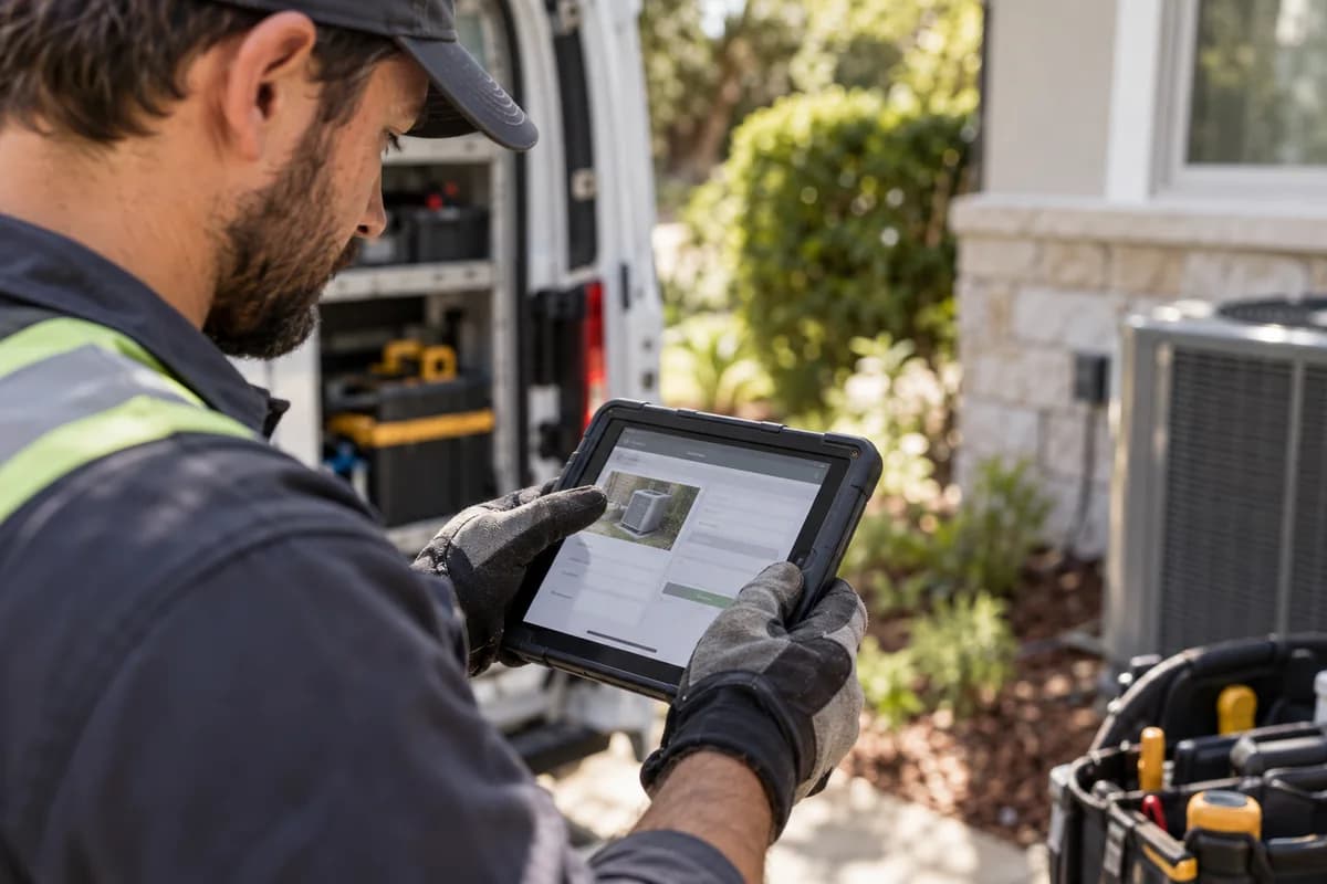
Consider a hypothetical appliance repair firm whose technicians log jobs on a tablet in the service van, where the first version of the completion form needed a stable connection. Entries vanished in basements. Rebuilding the form around an offline queue with a visible sync indicator is the fix that only becomes obvious once the app is tested where the work happens.
Field-app offline state mockup
One job-logging screen is shown in three states, offline with an entry queued, syncing, and confirmed on the server, each with its own icon, colour and message wording. No worker has to guess.
Open a blank worksheet to printQuestions owners ask
What happens when connectivity drops?
A well-built field app keeps working. Entries are saved on the device and queued, then sync automatically once a connection returns, so the worker keeps logging jobs without doing anything extra.
How can sync conflicts be shown clearly?
Flag the clash in plain words. Show both versions side by side and let the user choose, because silently picking one is how field data quietly becomes unreliable.
Which devices should we test on?
Use the oldest, cheapest handset in daily use, with a scratched screen and a bulky case, because that is the device that will expose slow screens and tiny targets. Newest phones hide problems. A flagship handset opens every screen quickly and forgives small targets, so it can pass tests that a worn handset on a cold morning fails.
Do supervisors need a separate app?
Often, because a supervisor reviews many jobs at once while a technician completes one at a time, and one design rarely serves both. Split the screens, not the data.