In this guide 6 sections
Bad screens waste time three ways. A routine task needs too many clicks, the same data is typed more than once, and status is invisible so people ask colleagues instead of glancing at a screen. Each leak can be timed and each can be fixed without rebuilding the system, provided you measure a baseline before touching anything.
Where the time leaks
Excessive clicks happen when a common action is buried three menus deep, or when a list must be refiltered every morning because the software forgets the last view. A click costs seconds. Across a team repeating the same task fifty times a day, those seconds add up to hours of paid time that produce nothing.
Duplicate entry happens when two screens or systems ask for the same information separately, such as a customer’s address typed once for the order and again for the invoice. Unclear status happens when software does not say whether an order is approved, a payment is pending or a ticket has been picked up, so people ask a colleague. Asking interrupts two people.
Take a retail chain whose stock transfer between two stores needs the same item list typed again, because transfer out and transfer in were built separately. Someone doing forty transfers a week retypes forty lists, and a mistyped quantity on the second entry is a silent error nobody catches until the month end count.
Measuring time, errors and rework on key tasks
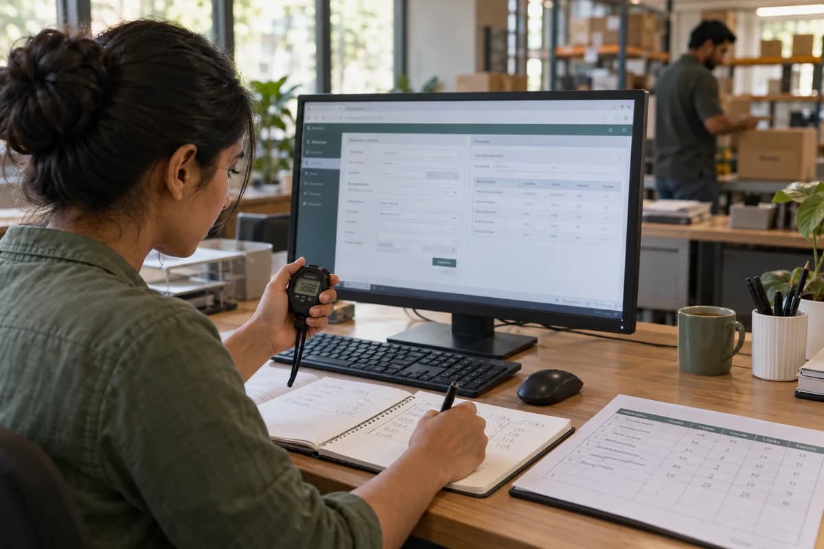
Pick four or five frequent tasks, such as creating an order, updating a customer record or closing a ticket, and record the time, the clicks and the redo rate. A stopwatch is enough. A simple spreadsheet and a handful of employees over a few days will give a usable baseline without special software, a licence or a long study.
Track rework separately because it often costs more than the original task: a form that accepts an obviously wrong quantity creates a later correction involving two people. One spots it, another fixes it. That downstream cost rarely gets attributed back to the screen, so the screen escapes blame while the team absorbs the delay quietly.
Finding the specific navigation and feedback problems
Menu problems show up as people opening the wrong menu first or not knowing where a completed action leaves them, and form problems show up as ambiguous fields. A date field that does not say its format and a screen that insists on a middle name are typical, as is a field order that ignores the task.
Feedback problems hide longest. A save button that never confirms the save, an error message reading something went wrong, or a long action with no sign of progress. People then submit twice, retype an entry, or stop trusting that the system did what they asked, and each habit multiplies the original delay.
Testing a redesign against the baseline
Run the same timed test again after the redesign, with the same tasks and ideally some of the same employees, because it is the only fair comparison. Nicer does not mean faster. A cleaner screen sometimes hides a step that used to be visible and quietly adds a click back in, which only a timed test will reveal.
Test with people who took no part in the fix, since someone close to a redesign uses it correctly because they know where everything went. Fresh eyes find real confusion. A colleague meeting the screen for the first time will hit the same confusion a new employee eventually will, which is the honest test of whether the improvement holds.
Connecting usability to what the business cares about
Time saved per task is the easiest number to collect, but owners are persuaded by what it adds up to across a team and a year. Add the cost of errors. A form that used to cause three misrouted orders a week carries a delivery delay, a customer call and a manual correction each time.
Frame usability work as hours recovered across a team, errors avoided and tickets closed faster, which are outcomes the business already tracks. Design stops looking cosmetic. It competes fairly with other priorities once the proposal states recovered hours and avoided corrections instead of promising a nicer looking interface to the people approving the budget.
Task-time measurement sheet
A spreadsheet template listing five to eight common tasks, with columns for time to complete, click count, rework rate and the employee’s own difficulty rating. Run it before and after the redesign.
Open a blank worksheet to printQuestions owners ask
How do we measure wasted effort?
Time a handful of routine tasks across several employees over a few days, and separately track how often each task has to be redone because of an error. Redo rate usually matters more.
Which screens should be improved first?
Start with the busiest tasks. A form used fifty times a day with a small friction point costs more than a rarely used screen that looks dated but works, so multiply frequency by friction.
How long does a measurement round take?
A few days is enough for the baseline, since the aim is a comparable number for four or five tasks and not a statistical study of the whole office. Keep the method identical afterwards.