In this guide 6 sections
UI is what a screen looks like. UX is whether a person can finish a task on it quickly, without confusion, and without asking a colleague what a button does. Business software needs both, because a screen can look tidy and still cost an accounts clerk several minutes of avoidable work every single day.
UI is the look, UX is whether the work gets done
UI, the user interface, is the visible layer of colours, spacing, fonts and icons, plus the position of every button and how each one reacts when somebody presses it. UX is broader and quieter. It covers the steps needed to finish a task, how many decisions that takes, and how clearly the software reports what just happened.
A screen can score well on UI and badly on UX at once: a modern palette and tidy icons, yet eleven clicks for something that should take two. The reverse also happens. A plain, unstyled stock transfer screen that mirrors how a warehouse supervisor thinks about the job will get used happily, badly aligned buttons and all. Get the second part right first.
What confusing workflows cost a business
A confusing customer-facing screen costs a sale or a support ticket, but a confusing internal screen charges a smaller fee every time an employee opens it. Small costs repeat all year. A purchase order screen that makes someone type the vendor details twice wastes seconds per order, multiplied by every order, every day, for years.
Three costs compound: rework when a form hides an important field, workarounds in WhatsApp or Excel because the official tool is slower, and training that never ends. None of it looks like a failure. It looks like a team that seems less productive than it should be, for reasons nobody has pinned down, and the owner blames people instead of screens.
How research, design and prototyping fit together
Good work follows a rough sequence, starting with research: watching or interviewing the staff who open the screen daily, and noting where today’s process breaks down. The constraints shape everything. A warehouse floor, a phone with patchy signal and a call centre with a ninety second target per call each demand a different screen.
Design turns that research into a screen flow, and prototyping makes the flow clickable so it can be tested before a single line of production code exists. Validation is usually skipped. Put the prototype in front of two or three real users and watch where they hesitate, misclick or ask a question that the screen should have answered. Each stage catches different mistakes cheaply.
A before-and-after example: approving a purchase request
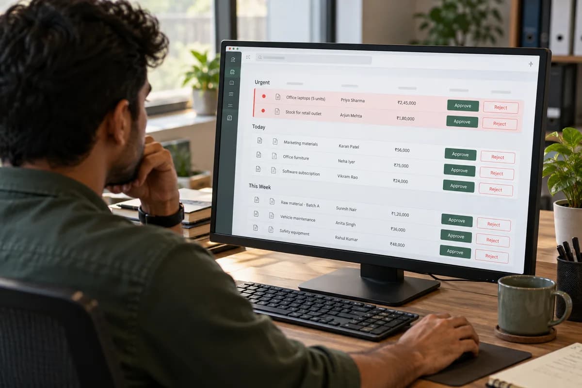
Take a trading company where a manager must approve a purchase request before an order goes out, and the request sits in a list beside twenty other records. Nothing marks the urgent ones. The approve button looks identical to a dozen other buttons, so managers miss requests, approve the wrong one by mistake, and staff phone around to make sure anything moves.
In the redesigned version, requests are grouped by urgency, the amount and requester show without a click, and approve and reject look different from navigation links. The data did not change. The approval logic did not change either, only the presentation and sequence, which is the whole difference: the same information arranged so the right person acts correctly first time.
Judging design by outcomes, not just appearance
The useful test is not whether software looks modern but whether daily users finish their jobs faster, with fewer errors, and with less frustration than before. That can be measured. Track time to complete a task, errors or support tickets tied to one screen, and how much a new hire must be told versus what the interface makes obvious.
Visual polish still matters because a scruffy interface can make people doubt data that is perfectly correct, but for internal tools it is a secondary outcome. Speed and accuracy come first. A redesign that only makes the software look nicer, without changing how quickly or correctly a task gets done, has missed the reason for doing UI and UX work.
Task-centred design comparison
A side by side view of one purchase approval screen before and after a UX pass, annotated with click counts and the confusion each change removes. Reuse it on your own screens.
Open a blank worksheet to printQuestions owners ask
Is UI/UX only for customer-facing apps?
No, internal tools gain more. Employees spend hours in them daily and cannot switch to a competitor’s app, so poor internal UX shows up as slower work and quiet workarounds instead of lost customers.
Can existing software be redesigned?
Yes, in most cases. A redesign rarely means rebuilding the whole system, because the data model and business logic often stay as they are while screens, navigation and flow change. Scope depends on the code.
How many users should test a prototype?
Two or three people who match the real job are enough for a first round, because the same confusion tends to appear in the first handful of sessions. Test again after fixing.