In this guide 6 sections
An audit has four steps. Inventory the key journeys, assess navigation, forms, accessibility and feedback, test real tasks on real devices, then rank findings by severity and frequency. Screenshots cannot do the third step. That step is where most damaging problems appear, because a flow only fails when someone tries to finish it on a cracked phone screen.
Inventorying journeys and user groups
List the user groups first, then the two or three tasks each group performs most often or can least afford to get wrong. Leave everything else out. A hypothetical agro-inputs distributor has reps who log visits and place orders, and managers who approve discounts and review territory results. Usability treats those as two apps.
That inventory becomes the spine of the audit, because every later step is measured against the list of journeys and never against the software in the abstract. Screens are many; journeys are few.
Write down the device each group uses, since that decides how the testing step runs, and flag any journey where an error costs money. Note the devices now.
Assessing navigation, forms, accessibility and feedback
Walk each journey screen by screen. Navigation: can a user find the next destination without guessing, and does the app say clearly where they are right now? Forms: are fields labelled, required inputs obvious, defaults sensible, and does validation catch a mistake before submission instead of after it?
Accessibility: is colour contrast readable, can the whole task be done by keyboard, and are mobile touch targets large enough for a thumb? Feedback: does the app confirm success, explain failure plainly, and show progress during anything slower than a couple of seconds? Screenshots catch layout slips here. They cannot show whether the whole flow holds together from start to finish, which needs a person attempting the task.
Record every finding with a screenshot, the exact steps and the device, so a developer can reproduce it without a meeting. Vague notes waste days.
Testing realistic tasks on real devices
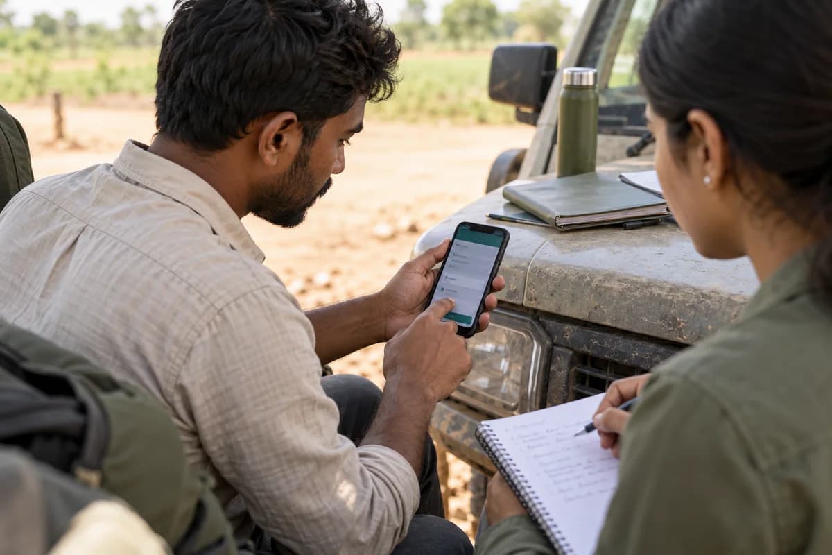
Screenshot audits skip this step. Give someone unfamiliar with the design a specific task, such as placing an order, then watch them do it on the devices the software really runs on. “Look around” is not a task.
That may mean a desktop browser for office staff and a mid-range Android phone with a cracked screen protector for the field team, so test on whatever matches reality. Some faults exist only on a small screen, over a patchy connection or under time pressure, so an office test on fast Wi-Fi will miss them. Convenience is the wrong guide.
Watch hands, not just screens. Where a tester hesitates, taps the wrong control or asks what a label means, there is a finding, even when they eventually complete the task.
Ranking findings by severity, frequency and impact
Unranked lists get ignored. Score every finding on three things: how often the affected task happens, how badly it hurts when it goes wrong, and how many people run into it.
A confusing label on a screen five people open monthly matters far less than an ambiguous field on a form fifty people submit daily. Ranking turns the audit into a plan. It also names the two or three fixes to make first and gives a reason for that order beyond whichever screen looked worst on the day.
Validating that fixes worked
The audit is not finished at release. Repeat the same task tests afterwards, ideally with different participants, to confirm the fix removed the problem and did not merely change its shape. New problems do appear.
Keep the original task list and baseline results on file, so the follow-up becomes a comparison against a known starting point and not a fresh investigation from scratch. Comparison is faster than discovery.
Usability audit scorecard
Journeys run down the rows, while columns hold ratings for navigation, forms, accessibility and feedback, a severity score, a frequency score and a final priority rank. Fill it in during assessment and testing. The result is one ranked action list.
Open a blank worksheet to printQuestions owners ask
Can an audit use only screenshots?
Not a complete one, no. Screenshots catch visible layout and consistency problems, but they cannot show whether a multi-step task works or how the app behaves on the devices and connections people use.
How should issues be prioritised?
Frequency beats drama every time. A small annoyance on a daily task usually outranks a serious-looking fault on a screen almost nobody opens, because weekly impact is what counts.
How many people should test?
A handful of people per user group will usually surface the repeated problems, and a second round after the fixes will show whether they worked.
What belongs in the final report?
Include the ranked list, the evidence for each item and the journeys that passed cleanly, so the team also knows what to leave alone. Clean passes are findings too. A journey that tested well today is a baseline worth defending when the next release changes the screens around it.